Gapminder
Led a comprehensive research project for Gapminder Foundation, uncovering key user pain points to guide feature development. Developed responsive wireframes and prototypes for a data visualization tool redesign, enhancing interaction flows and UI elements such as search boxes and mega menus.
My role
User Experience Designer
Company
Gapminder
Year
2022
Intro
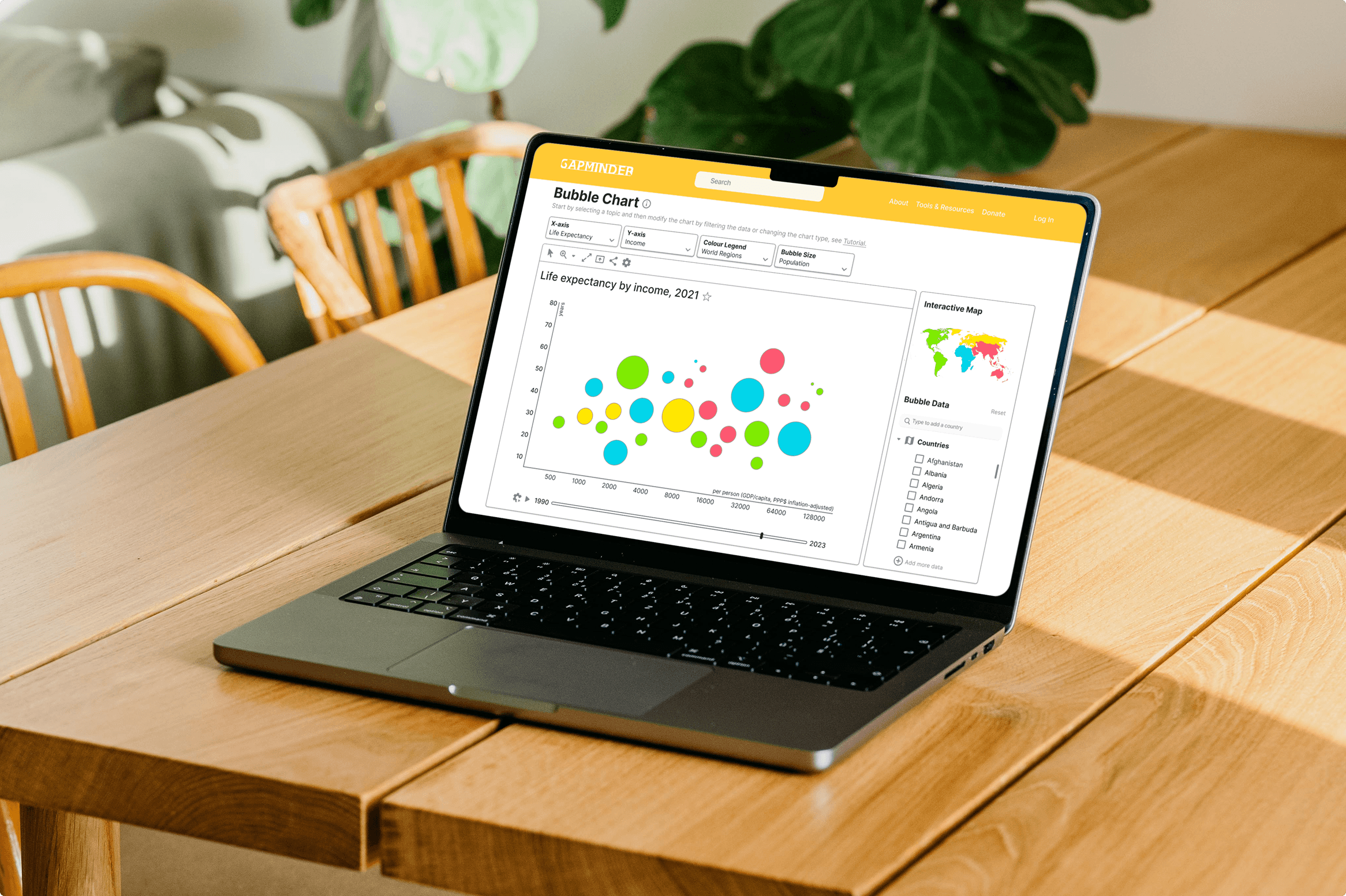
Gapminder desired to support playful data explorations which encourage positive interactions with their current misconception tool- Bubble Chart. The problem was the lack of seamless experience which handles proactive data exploration that users are truly satisfied with. The objective was to research, strategise and design novel interactions with a focus on increasing the user interaction with the existing tools and resources.
Challenges and Objectives
The project aimed to balance technical complexities with user capabilities to ensure seamless interaction, design UI controls with clear affordances and discoverability, and address sparse data while maintaining user engagement through playful exploration.
Solution
Part I: Empathise
I conducted usability interviews with five educators and researchers, aged 25-60, to understand their views on finding and using statistical data and their methods for sharing data explorations with students and colleagues. Here are the key takeaways:
Educators and researchers felt overwhelmed by complex interfaces and unclear steps, hindering their efficiency in achieving goals.
They struggled with presenting data to diverse audiences and expressed a need for more interactive and dynamic visualisations to enhance communication and engagement.

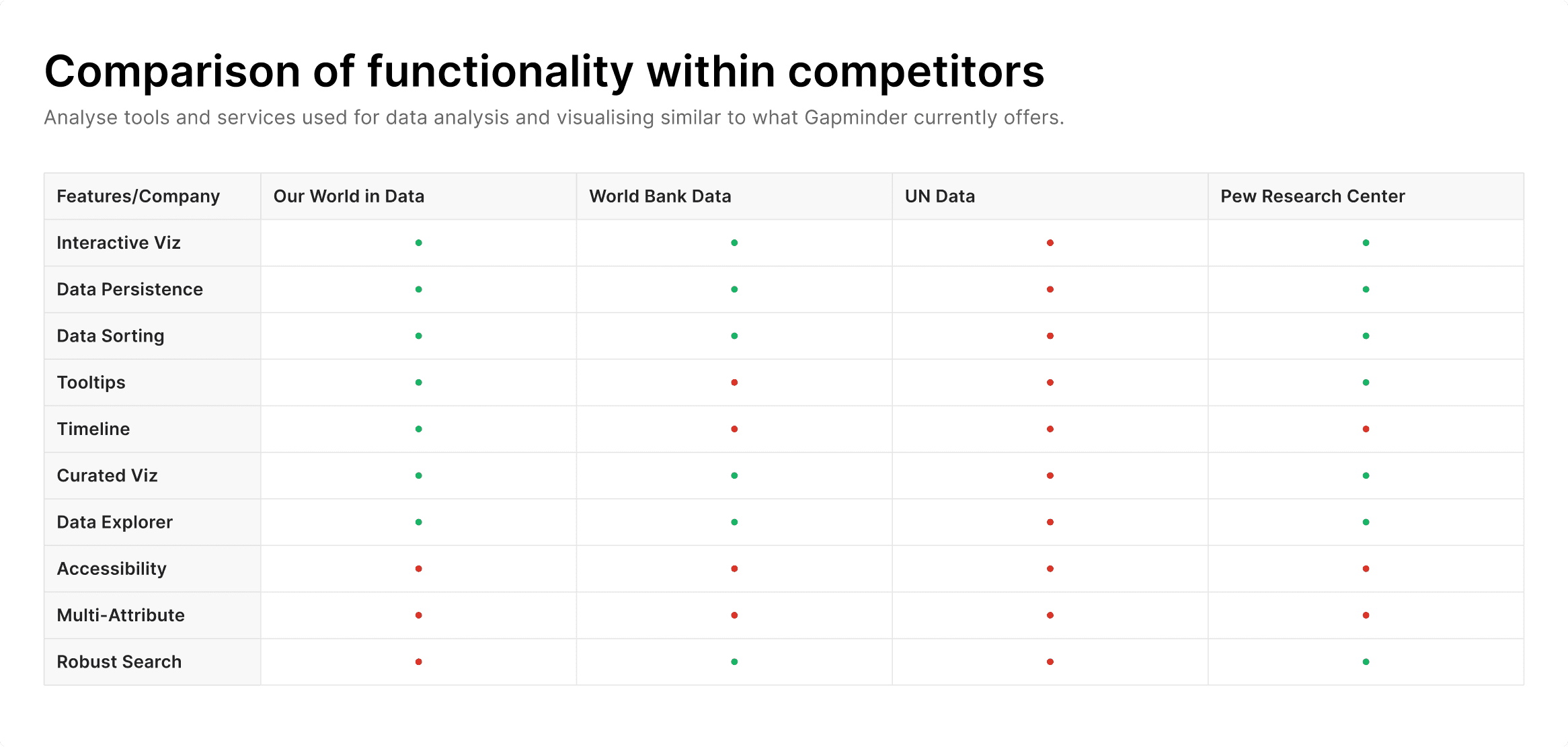
I dived deep into understanding the current trends in data visualisation by conducting a competitive audit of key industry players—Our World in Data, UN Data, Pew Research Centre, and others. The key takeaways were:
Competitors offer diverse and interactive data visualization tools, enhancing user experience and understanding through features like intuitive maps and informative tooltips.
Some platforms have static and rigid visualizations, and limited interactivity, which can hinder comprehensive data analysis.
Gapminder can enhance user experience by curating and recommending visualisations, breaking down complex data into smaller, themed segments for easier exploration.
Part II: Conceptualise
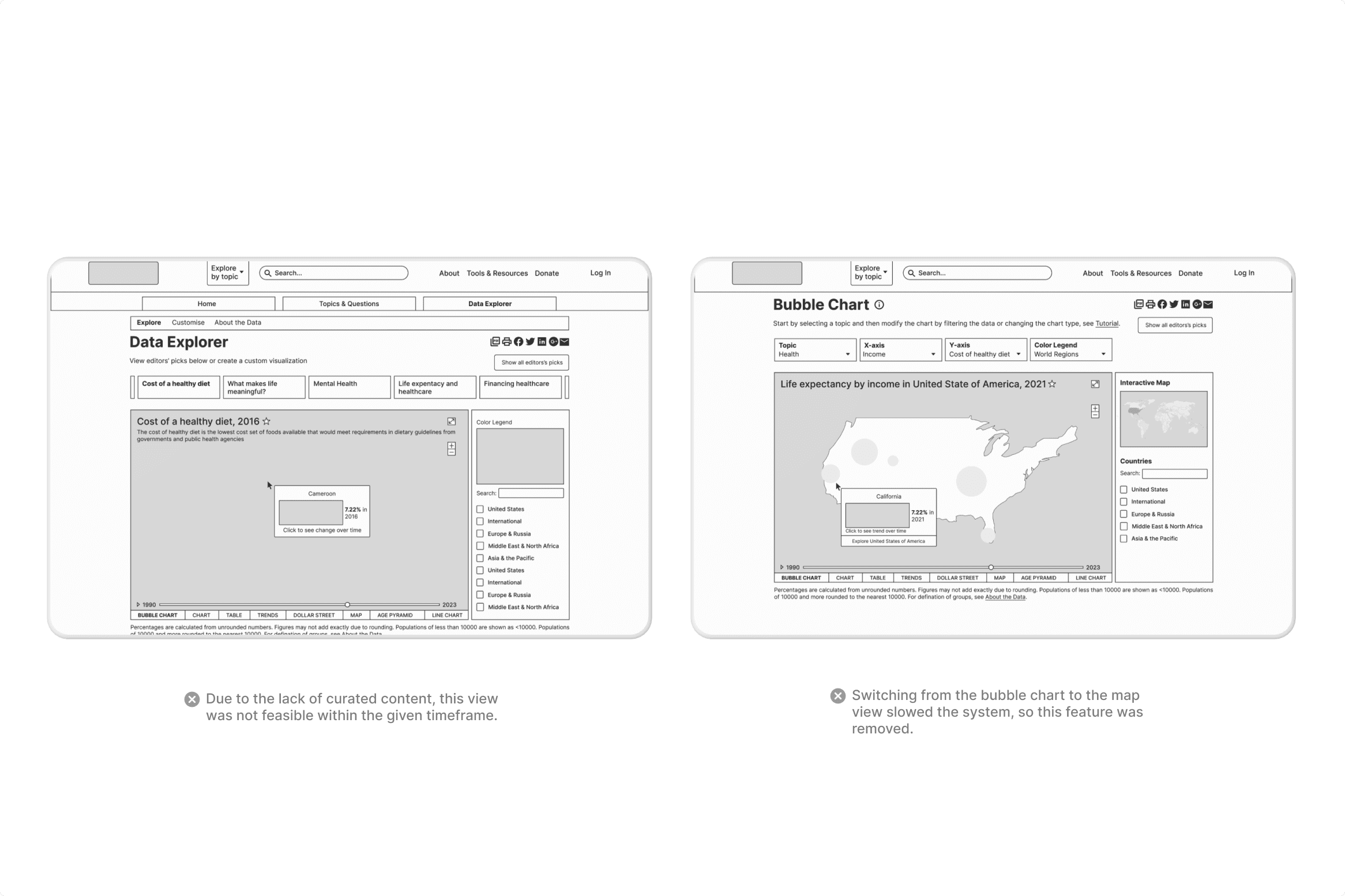
The project solution addressed educators' and researchers' pain points of navigating complex interfaces and presenting data to diverse audiences using design principles like usability, clarity, and engagement. Multiple design directions were explored and tested, with final choices guided by usability, scalability, technical feasibility, and accessibility.
Part III: Design
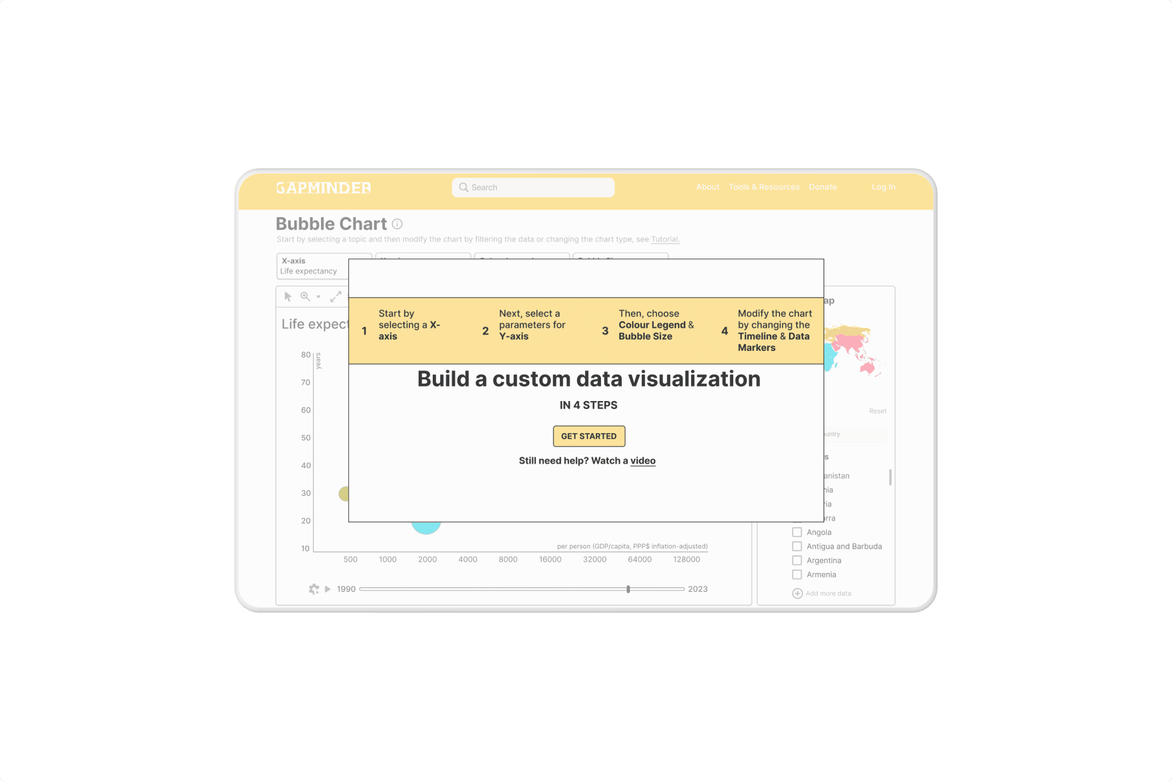
Progressive disclosure streamlines the user experience by revealing essential features first and secondary options only upon request. This strategy simplifies the initial interface, promoting quick learning and efficient use while reducing errors. Novices benefit from focused, manageable options, while experts can bypass basics and access advanced functions as needed, enhancing usability for all.
To enhance user assistance, it's crucial to integrate help content seamlessly into the user's workflow. Intrusive tutorials can disrupt the experience and are often forgotten, while contextual clues for on-demand 'pull revelations' provide timely support without overwhelming the user. This approach aligns with the 'paradox of the active user,' catering to the user's desire to engage with the product immediately. Help features should be non-intrusive, easy to dismiss, and equally easy to access when needed. Employing progressive disclosure for help content allows users to discover additional information as they require, facilitating a smoother, more intuitive learning experience.
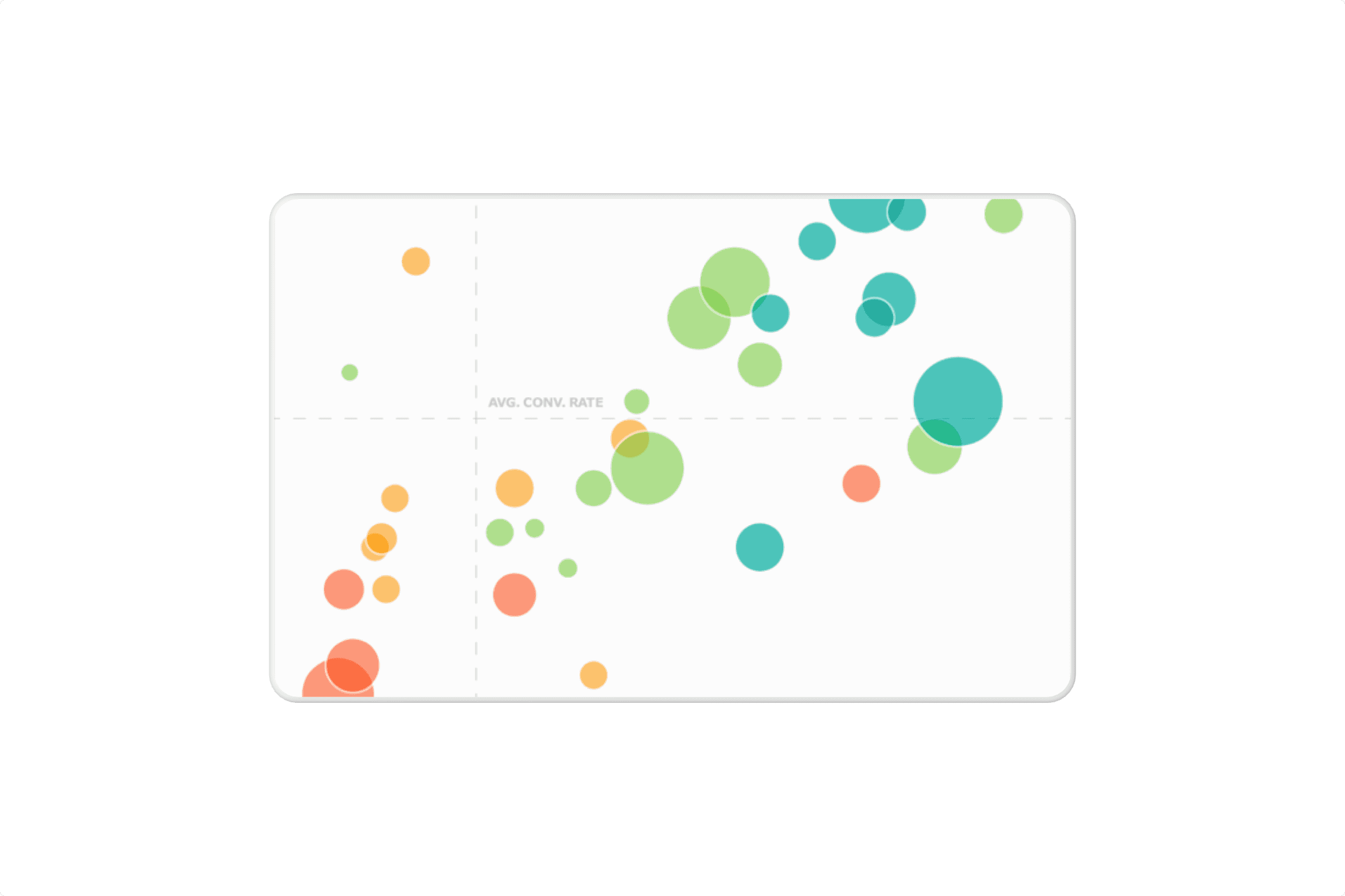
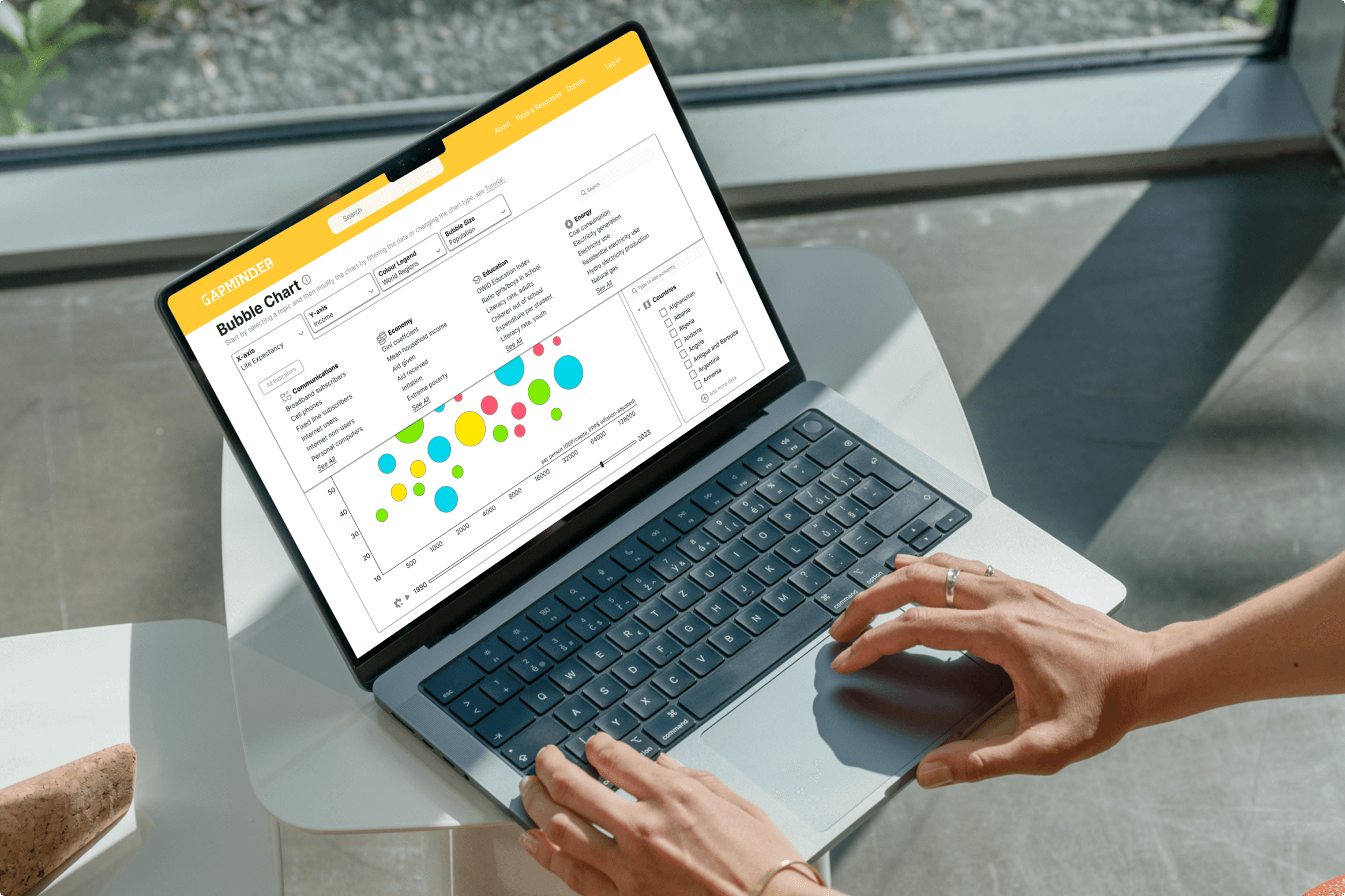
Data sparseness is effectively addressed by employing interactive visualizations like the bubble chart, which enhance user engagement through their capacity to reveal complex relationships within limited datasets. Interactive tools, such as dynamic tooltips, sliders for temporal data exploration, and filters for specific variables, enable users to actively engage with the data, uncovering insights that might otherwise remain hidden in a sparser dataset. By presenting data in various dimensions with clear visual cues such as size and color, even sparse data becomes rich with meaning, allowing for a more comprehensive understanding and analysis. These interactive visualizations turn potential challenges of data sparsity into opportunities for user-driven exploration and discovery.
Results & Impact
The redesigned Bubble Chart significantly improved user satisfaction by providing a more seamless and interactive data exploration experience. Users reported enhanced engagement and a better understanding of complex data through intuitive features and dynamic visualizations.